Building a funnel chart, and customizing its output
Pedro Duarte Faria
funnel.RmdIntroduction
The ggfunnel package uses ggplot2 to build a Power BI like funnel chart. The main functionality of the package is available trough the ggfunnel::funnel() function. You just give the data.frame with your data to the function, and specify which are the columns for the levels and the values of the funnel chart. The ggfunnel::funnel() function will do the rest for you:
library(ggfunnel)
# Using the `ggfunnel::aggregates` data.frame as example:
print(ggfunnel::aggregates)
#>   Step N_users
#> 1    A    4389
#> 2    B    3100
#> 3    C    2005
#> 4    D     500
#> 5    E     120
# Ploting a funne chart that shows the distribution of users
# across the different "steps".
plot <- ggfunnel::aggregates |>
  ggfunnel::funnel(
    values = N_users, levels = Step
  )

print(plot)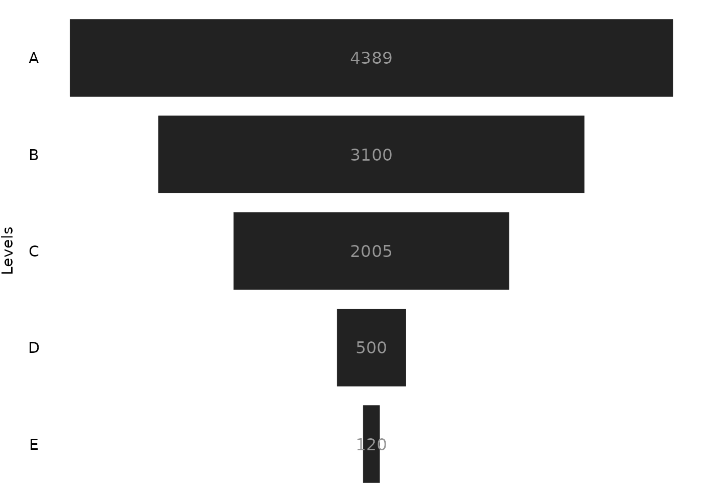
How it works ?
In essence, the ggfunnel::funnel() function uses the ggplot2::geom_tile() geom from ggplot2 to draw the rectangles that composes the funnel chart. Optionally (depending on the value of the labels argument), the function will use the ggplot2::geom_text() geom as well to draw the labels of the plot.
All rectangles drawn by ggplot2::geom_tile(), are centered at a fixed point of the x axis (usually at zero) and uses the same height ratio (which currently is 0.8 as default). But their widths vary depending on the percentage their represent to the max value in the funnel.
In other words, if we take the 3100 value from the plot of the previous example, this 3100 is approximately 70% of the maximum value found in the set (which is 4389). As a result, the width of the rectangle that represents this 3100 value is approximately 0.7.
The maximum value in the set is always the top rectangle in the funnel, and the minimum value on the set is always at the bottom rectangle of the funnel. Since the top rectangle in the funnel represent the maximum value in the set, his width is always 1, because its value represents 100% of the maximum value in the set.
Therefore, the widths of each rectangle are the percentage of the value they represent to the maximum value of the set.
Using the stat argument to aggregate data
By default, ggfunnel::funnel() will always try to aggregate the data you deliver. But you can use the stat argument to change this behaviour.
Lets take the df object below as an example:
set.seed(15)
df <- data.frame(
  letter = c("A", "A", "A", "B", "C", "C", "D"),
  value = sample(320:5400, size = 7)
)

df
#>   letter value
#> 1      A  4910
#> 2      A  2017
#> 3      A  4592
#> 4      B   580
#> 5      C  4398
#> 6      C  1706
#> 7      D   915
The letter column is clearly a kind of categorical data, and the value column contains numerical data that we might want to visualize in a funnel chart. When you give this df object, as is, to ggfunnel::funnel(), two things happens to the df object before it is shipped to ggplot2::ggplot(), to start the ggplot2 chart:
ggfunnel::funnel(
  df, levels = letter, values = value
)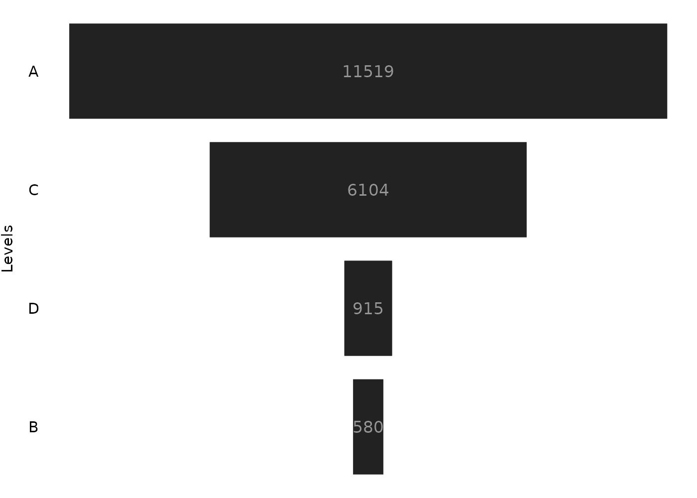
First, ggfunnel::funnel() will group the data inside the df object by using dplyr::group_by(). The data is always grouped by using the column that you gave at the levels argument. In other words, the data is always grouped by using the categorical data you want to use in the funnel chart.
Second, after it grouped the given data.frame, ggfunnel::funnel() will aggregate your data using dplyr::summarise(). The operation applied inside the dplyr::summarise() function depends on the value you configured at the stat argument. The stat argument accepts three string values, which are:
-
"sum": the default, aggregates the data by summing thevaluescolumn; -
"count": aggregates the data by counting the number of rows for each value atlevelscolumn; -
"identity": do not aggregate the data, and just interpret the data as is;
By default, ggfunnel::funnel() uses the "sum" value at the stat argument, which means that it applies the sum() function over the column you gave at the values argument. In other words, it applies the sum() function over the numerical data you want to present in the funnel chart.
Having this in mind, the resulting aggregated data from the df object that is used in the plot, is:
df |>
  dplyr::group_by(letter) |>
  dplyr::summarise(value = sum(value))
#> # A tibble: 4 × 2
#>   letter value
#>   <chr>  <int>
#> 1 A      11519
#> 2 B        580
#> 3 C       6104
#> 4 D        915
This data.frame above is the data that is used to build the funnel chart, not the original df object.
The ggfunnel::funnel() function is designed to do all of this work, because a funnel chart is a chart to visualize aggregated data. In other words, funnel charts are not commonly used to visualize raw data, or, lots of observations at the same time. So, if you deliver raw data to ggfunnel::funnel() it will try to aggregate your data by default.
However, although this is a useful feature, you might want to suppress it. In other words, you might already have aggregated data inside your data.frame, and, you just want to visualize them in a funnel chart, without aggregating it again.
To use your data, as is, in the funnel chart, you just need to set the stat argument to "identity" (stat = "identity"). This way, ggfunnel::funnel() understands that you already have an aggregated dataset, and, therefore, that it needs no further transformations.
How to customize the output ?
ggfunnel::funnel() uses a default theme and specifications in the resulting plot. But you might want to customize some aspects of the output. In this case, you can use the tile_specs, text_specs and theme arguments of ggfunnel::funnel() to apply these customizations.
Customizing the rectangles
If you want to change the aspects of the rectangles that form the funnel chart, than, this means you want to change the specifications of the ggplot2::geom_tile() used to build the chart.
For example, a very commom you might want to change in these rectangles is the filling color or them. To do this, you must use the tile_specs argument of ggfunnel::funnel(). You give a list with the new color you want to apply on the fill element, like in the example below:
plot <- ggfunnel::aggregates |>
  ggfunnel::funnel(
    values = N_users, levels = Step,
    tile_specs = list(fill = "#eb4034")
  )

print(plot)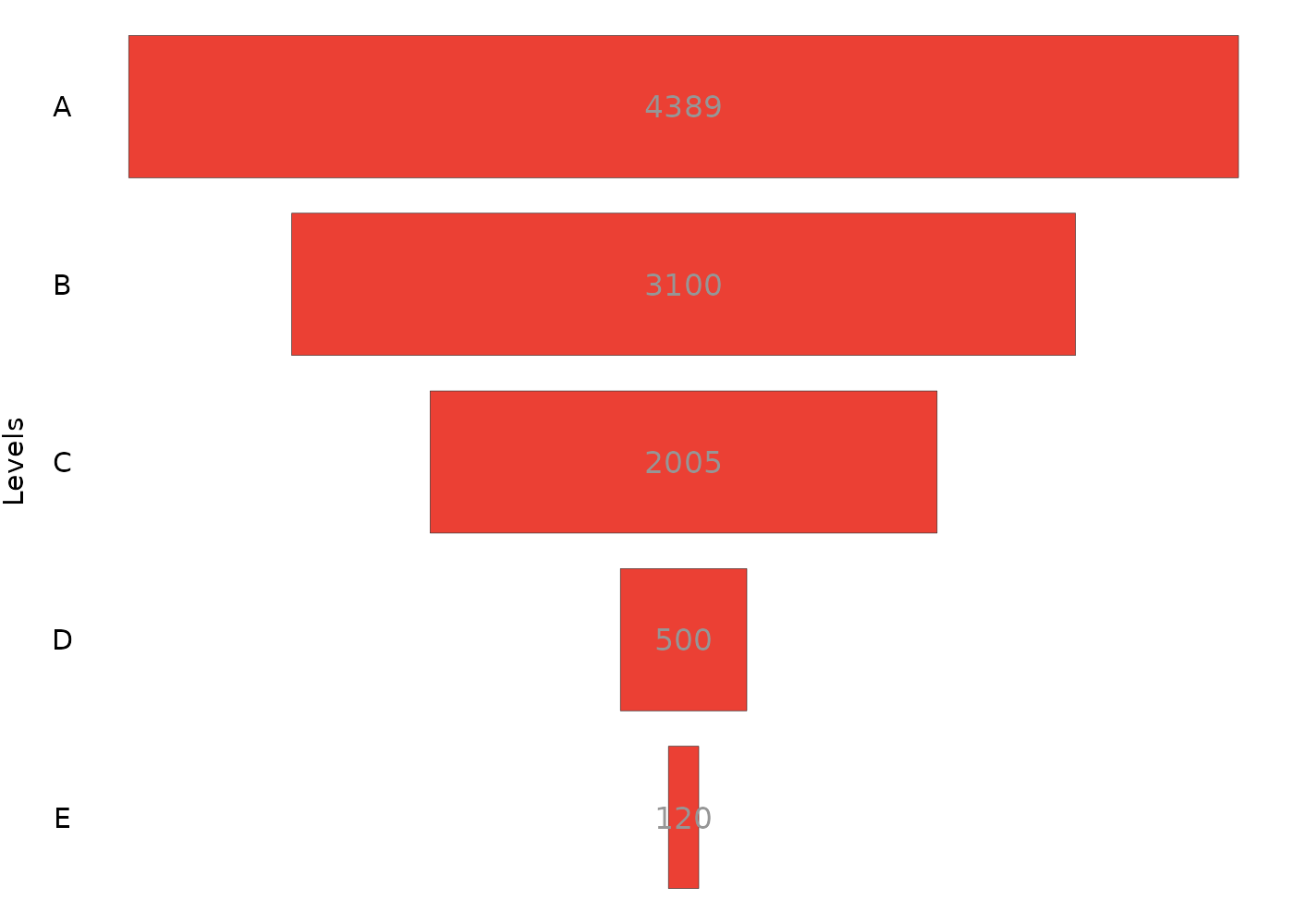
This new color will be passed to the fill argument of ggplot2::geom_tile(). This means that you change the default value associated with any argument of ggplot2::geom_tile() with this list given to tile_specs.
As another example, I could change the heights and the contour color of all rectangles by setting the height and colour elements of the list. Like this:
plot <- ggfunnel::aggregates |>
  ggfunnel::funnel(
    values = N_users, levels = Step,
    tile_specs = list(
      fill = "#eb4034",
      height = 0.4,
      colour = "blue"
    )
  )

print(plot)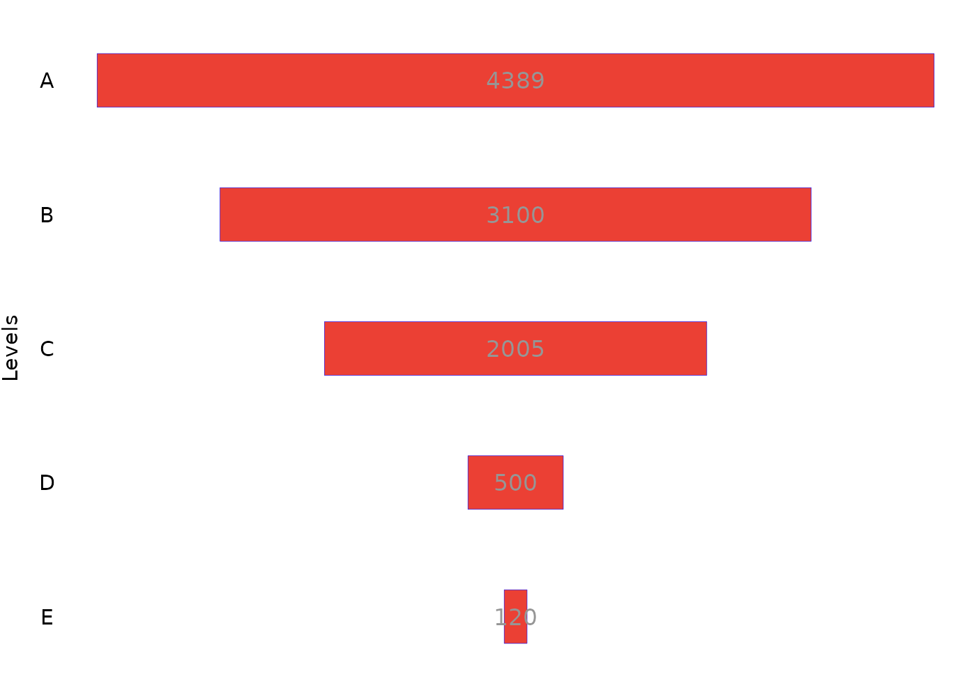
Customizing the labels
You can also customize the labels used in the plot. You just to follow the exact same process you did to customize the ggplot2::geom_tile() used in the plot. That is, you give to the text_specs argument a list with the new values you want to use at any argument of the ggplot2::geom_text().
For example, I could change the size, color and the font used in the labels by setting the size, colour and family elements of the list, like this:
plot <- ggfunnel::aggregates |>
  ggfunnel::funnel(
    values = N_users, levels = Step,
    text_specs = list(
      colour = "#eb4034",
      family = "serif",
      size = 10
    )
  )

print(plot)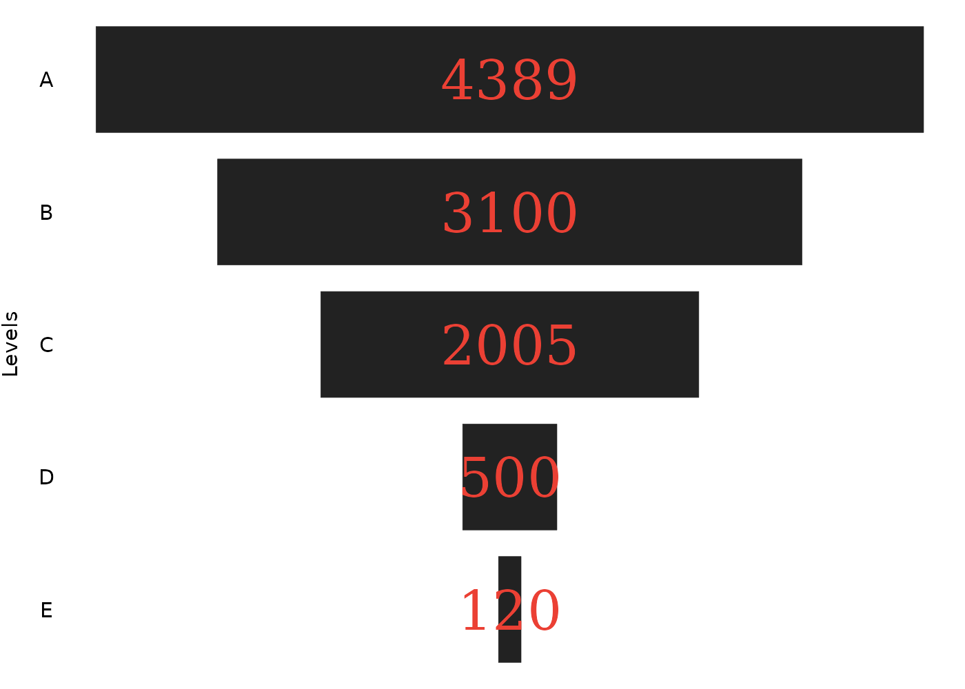
A common tweak you might want to make to the plot, is to nudge some labels to the right, or to the left, by a specific amount. To do this, you give a vector to the nudge_x element of the list. Each element of this vector is a offset value to be added to the position of each label. In the example below, I am nudging only the last label to the right (use a negative offset value to nudge the label to the left).
plot <- ggfunnel::aggregates |>
  ggfunnel::funnel(
    values = N_users, levels = Step,
    text_specs = list(
      colour = "#eb4034",
      nudge_x = c(rep(0, times = 4), 0.1)
    )
  )

print(plot)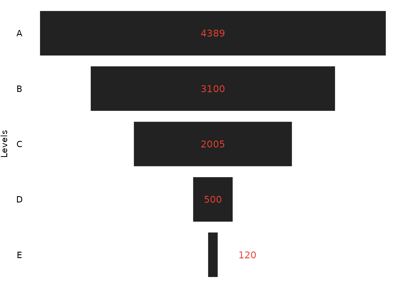
Another thing you might want to do, is to apply a specific color at some labels, and, apply another color at the other set of labels. For this, you take a similar approach to the above example, and, give a vector to the colour element of the list you provided to text_specs. In the example below, I am coloring all labels of white, except the last one, which is now black.
plot <- ggfunnel::aggregates |>
  ggfunnel::funnel(
    values = N_users, levels = Step,
    text_specs = list(
      nudge_x = c(rep(0, times = 4), 0.05),
      colour = c(rep("white", times = 4), "black")
    )
  )

print(plot)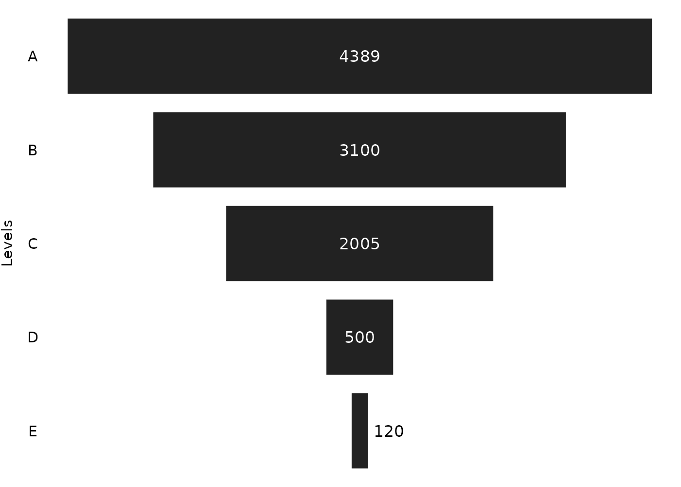
Adding more elements to the plot
Since ggfunnel::funnel() returns as output, the raw ggplot object that describes the funnel chart, you can also add much more content to the plot by adding new geoms, themes, titles and scales, as you would normally do with any other kind of ggplot2 plot.
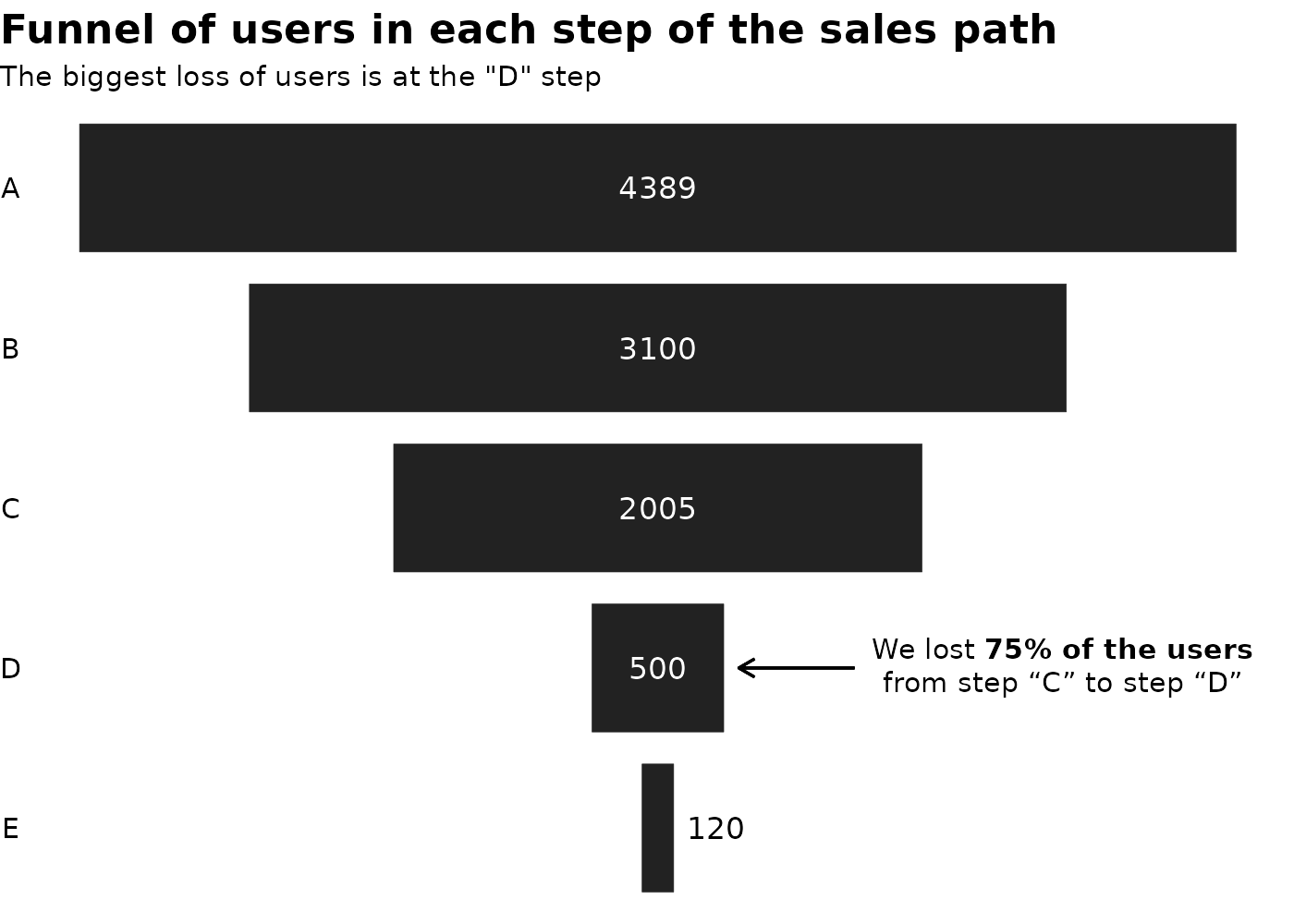
In the example below, we are adding title and subtitle to the plot, adjusting the theme, and adding some notes and arrows to emphasize some parts of the plot.
plot <- ggfunnel::aggregates |>
  ggfunnel::funnel(
    values = N_users, levels = Step,
    text_specs = list(
      nudge_x = c(rep(0, times = 4), 0.05),
      colour = c(rep("white", times = 4), "black")
    )
  )

note <- "We lost **75% of the users**<br>from step \"C\" to step \"D\""

plot +
  ggplot2::labs(
    title = "Funnel of users in each step of the sales path",
    subtitle = "The biggest loss of users is at the \"D\" step",
    y = NULL
  ) +
  ggplot2::theme(
    plot.title = ggplot2::element_text(face = "bold", size = 16),
    plot.title.position = "plot"
  ) +
  ggtext::geom_richtext(
    ggplot2::aes(x = 0.35, y = "D",
    label = note),
    label.color = NA
  ) +
  ggplot2::geom_segment(
    ggplot2::aes(x = 0.17, xend = 0.07, y = "D", yend = "D"),
    arrow = ggplot2::arrow(
      length = ggplot2::unit(0.25, "cm")
    )
  )